Blogs
9 Steps to Design a User-Friendly Website
October 11, 2024 /
0 Comments
/
in Uncategorized
/
webmaster
9 Steps to Design a User-Friendly Website
 Creating a user-friendly website is essential for keeping visitors engaged and encouraging them to explore your products or services. A well-designed site should be easy to navigate, visually appealing, and functional. Follow these steps to build a website that offers a smooth, enjoyable experience for all users.
Step 1. Understand Your Audience
Before you start designing, get to know your users. Identify their needs, preferences, and pain points. This understanding will guide your design decisions and ensure that your website meets their expectations. Tip: Conduct surveys or interviews with potential users to gather insights about their browsing habits and preferences.Step 2. Plan Your Website Structure
 Create a site map that outlines the main sections and pages of your website. Organizing your content logically helps visitors find what they need quickly.
Tip: Limit top-level menu items to 5-7 categories for simplicity and clarity.
Create a site map that outlines the main sections and pages of your website. Organizing your content logically helps visitors find what they need quickly.
Tip: Limit top-level menu items to 5-7 categories for simplicity and clarity.
Step 3. Design a Clean and Simple Layout
 Aim for a straightforward design that avoids clutter. Use white space to enhance readability and highlight important elements.
Tip: Choose a grid-based layout to maintain alignment and balance throughout your pages.
Aim for a straightforward design that avoids clutter. Use white space to enhance readability and highlight important elements.
Tip: Choose a grid-based layout to maintain alignment and balance throughout your pages.
Step 4. Optimize Navigation
Ensure that your navigation is intuitive and easy to use. Use clear labels for each menu item, and consider using a breadcrumb trail to help users keep track of their location on the site. Tip: Test your navigation with real users to identify any confusing elements.Step 5. Focus on Readability
Make sure your content is easy to read. Use legible fonts, adequate spacing, and a color scheme that contrasts well. Break up long blocks of text with headings and bullet points. Tip: Keep your font size at least 16px for body text and use a font that is easy on the eyes.Step 6. Ensure Mobile Responsiveness
 Your website should provide a seamless experience on all devices. Use responsive design techniques to ensure your site adjusts well to different screen sizes, from desktops to smartphones.
Tip: Test your website on multiple devices and browsers to ensure compatibility.
Your website should provide a seamless experience on all devices. Use responsive design techniques to ensure your site adjusts well to different screen sizes, from desktops to smartphones.
Tip: Test your website on multiple devices and browsers to ensure compatibility.
Step 7. Use Clear Calls-to-Action (CTAs)
 Guide users toward desired actions by using clear and compelling CTAs. Make sure they stand out visually and are placed strategically throughout your website.
Tip: Use actionable language like “Get Started” or “Contact Us” and position CTAs above the fold.
Guide users toward desired actions by using clear and compelling CTAs. Make sure they stand out visually and are placed strategically throughout your website.
Tip: Use actionable language like “Get Started” or “Contact Us” and position CTAs above the fold.
Step 8. Incorporate Engaging Visuals
 photo: stock cake
Use high-quality images and videos to capture attention and enhance your message. Ensure that visuals are relevant to your content and do not slow down your site’s load time.
Tip: Optimize images for web use to maintain fast loading speeds.
photo: stock cake
Use high-quality images and videos to capture attention and enhance your message. Ensure that visuals are relevant to your content and do not slow down your site’s load time.
Tip: Optimize images for web use to maintain fast loading speeds.
Step 9. Test and Gather Feedback
 After launching your site, continuously test its performance and gather user feedback. Use analytics tools to track user behavior and identify areas for improvement.
Tip: Implement A/B testing to evaluate different design elements and see which ones resonate better with your audience.
---
By following these nine steps, you can design a user-friendly website that not only looks great but also functions smoothly and meets the needs of your visitors. Remember, creating an effective website is an ongoing process that involves regular updates and adjustments based on user feedback and changing trends.
Need assistance with building or maintaining your website? Contact Pixel8 Web Solutions for expert guidance tailored to your business needs.
After launching your site, continuously test its performance and gather user feedback. Use analytics tools to track user behavior and identify areas for improvement.
Tip: Implement A/B testing to evaluate different design elements and see which ones resonate better with your audience.
---
By following these nine steps, you can design a user-friendly website that not only looks great but also functions smoothly and meets the needs of your visitors. Remember, creating an effective website is an ongoing process that involves regular updates and adjustments based on user feedback and changing trends.
Need assistance with building or maintaining your website? Contact Pixel8 Web Solutions for expert guidance tailored to your business needs. 9 Best Practices for UX and UI Design on Business Websites
October 9, 2024 /
4 Comments
/
in Uncategorized
/
webmaster
9 Best Practices for UX and UI Design on Business Websites
 photo: pexels
When it comes to designing a business website, two key concepts you’ll hear a lot are User Experience (UX) and User Interface (UI). But what do they actually mean?
UX (User Experience) is about how easy and enjoyable it is for users to interact with your website. It focuses on the overall experience someone has when they visit—how smoothly they can find information, how quickly they can complete tasks, and how satisfied they feel when they leave.
UI (User Interface) is all about the look and feel of the website. It’s how the site is designed visually—think of the buttons, menus, and colors that make your site look appealing and guide users through their journey.
Now, let’s break down the 9 simple tips to improve UX and UI on your business website.
photo: pexels
When it comes to designing a business website, two key concepts you’ll hear a lot are User Experience (UX) and User Interface (UI). But what do they actually mean?
UX (User Experience) is about how easy and enjoyable it is for users to interact with your website. It focuses on the overall experience someone has when they visit—how smoothly they can find information, how quickly they can complete tasks, and how satisfied they feel when they leave.
UI (User Interface) is all about the look and feel of the website. It’s how the site is designed visually—think of the buttons, menus, and colors that make your site look appealing and guide users through their journey.
Now, let’s break down the 9 simple tips to improve UX and UI on your business website.
1. Know Your Audience
Before designing your website, think about who will be using it. What do they want to find? Are they looking for information or to make a purchase? Knowing your audience helps you create a website that meets their needs and makes it easy for them to navigate.2. Make Navigation Simple
Your website should be easy to navigate. Visitors shouldn’t struggle to find what they’re looking for. Use a clear and simple menu, organize your pages logically, and always have a search bar in case they need it.3. Ensure It Works on All Devices
Today, many people visit websites on their phones and tablets. A responsive website automatically adjusts to look good and work well on any screen size. This not only makes your visitors happy, but it also helps your site rank higher on Google. To learn more about how you can make sure your website is responsive across all devices, check out our blog post on How to Ensure Your Website is Responsive on All Devices.
4. Make It Load Quickly
 People don’t like waiting. If your website takes too long to load, visitors will leave. Compressing images, simplifying code, and using fast hosting can improve your website’s speed and keep visitors on your site.
5. Use Consistent Design
 Consistency in design makes your site look professional. Stick to the same fonts, colors, and style across your site to strengthen your brand and make the site easier to use.
6. Make Your Content Easy to Read
Choose fonts that are easy to read and make sure there’s enough space between lines. Break up large chunks of text with headings, bullet points, and images to make it easy for visitors to skim through your content.7. Add Clear Calls-to-Action (CTAs)
CTAs are buttons or links that tell your visitors what to do next, like "Buy Now" or "Contact Us." Make sure they stand out by using bright colors and placing them where visitors can easily see them.
8. Make Your Website Accessible
Your website should be easy for everyone to use, including people with disabilities. Adding alt text to images, using readable fonts, and following accessibility guidelines helps ensure that everyone can interact with your site.9. Test and Improve
A great website isn’t built in a day. Keep testing how users interact with your site, gather feedback, and make improvements as you go. This ensures your site continues to meet user expectations and business goals.Need Help with UX/UI Design?
Creating a business website that looks good and works well doesn’t have to be complicated. At Pixel8, we specialize in designing websites that provide a great user experience (UX) and a visually appealing interface (UI). Contact us today to discuss how we can help make your website stand out!How to Ensure Your Website is Responsive on All Devices
October 8, 2024 /
4 Comments
/
in Uncategorized
/
webmaster
How to Ensure Your Website is Responsive on All Devices
 photo: pexels
People access websites from many devices—smartphones, tablets, laptops, and desktops. To make sure your website works well on all of them, it needs to be responsive. But what does that mean? Simply put, a responsive website adjusts its layout and design to fit any screen size, so it looks good and works smoothly whether someone visits from a phone or a computer.
Here’s how you can ensure your website is responsive on all devices.
photo: pexels
People access websites from many devices—smartphones, tablets, laptops, and desktops. To make sure your website works well on all of them, it needs to be responsive. But what does that mean? Simply put, a responsive website adjusts its layout and design to fit any screen size, so it looks good and works smoothly whether someone visits from a phone or a computer.
Here’s how you can ensure your website is responsive on all devices.
Choose a Responsive Design
If you’re starting from scratch, make sure your website is built with a responsive design. This means it automatically adapts to different screen sizes. At Pixel8, we design custom, responsive websites from the UI mockup stage to the actual development, so you don’t need to worry about coding or technical details.Test Your Website on Multiple Devices
After your website is set up, test it on different devices. Open it on your phone, tablet, and computer. Does it look good on all of them? Is it easy to navigate? If something seems off, it may need adjusting to be fully responsive.
Simplify the Navigation
 A cluttered or complicated menu can frustrate visitors, especially on smaller screens. Keep your navigation simple and easy to use. Consider having a “hamburger” menu (the three-line icon you see on mobile websites) to make browsing on phones more straightforward.
Make Sure Text is Readable
Your website’s text should be easy to read on both small and large screens. Avoid tiny fonts or too much text in one area. Make sure headings and buttons are big enough to tap on a phone without zooming in.Use Mobile-Friendly Images and Videos
Large images and videos can slow down your website, especially on mobile. Use optimized images that load quickly, and consider using smaller video files to improve performance. Remember, a slow site can lead to visitors leaving before they see what you offer.Call in the Experts
Feeling overwhelmed? Companies like Pixel8 specialize in making sure your website is fully responsive. Whether you need an assessment of your current site or help building a new one, Pixel8 can handle all the technical details, saving you time and frustration.Regularly Update and Check Your Site
Technology evolves quickly. Even if your website works perfectly today, it’s essential to regularly check and update it to ensure it continues to perform well on all devices. This not only helps you keep up with new trends but also ensures your visitors remain happy and engaged. If keeping your website up-to-date feels overwhelming, we offer website maintenance services to handle everything for you. From regular updates to performance checks, we ensure your site stays optimized and responsive, so you can focus on running your business. --- Having a responsive website is key to reaching customers no matter what device they’re using. By focusing on a few simple steps—or getting help from experts like Pixel8—you can ensure your site provides a great experience for everyone, helping you grow your business. Contact us today to get started with professional website optimization and maintenance!Why Your Website Must Be Mobile-Friendly
October 4, 2024 /
2 Comments
/
in Uncategorized
/
webmaster
Why Your Website Must Be Mobile-Friendly
 photo: pexels
Having a mobile-friendly website is no longer optional; it’s a necessity. The latest data reveal that 70 percent of the world’s total population now uses a mobile phone, with the number of “unique” mobile users reaching 5.68 billion in July 2024 (Source: DataReportal). This staggering statistic highlights the significant role that mobile devices play in how consumers access information and engage with businesses online.
photo: pexels
Having a mobile-friendly website is no longer optional; it’s a necessity. The latest data reveal that 70 percent of the world’s total population now uses a mobile phone, with the number of “unique” mobile users reaching 5.68 billion in July 2024 (Source: DataReportal). This staggering statistic highlights the significant role that mobile devices play in how consumers access information and engage with businesses online.
Enhanced User Experience
 photo: pexels
A mobile-friendly website ensures that visitors have a seamless experience regardless of the device they’re using. With more people browsing the internet on their smartphones and tablets, a website that is not optimized for mobile can frustrate users, leading to high bounce rates. A mobile-responsive design provides easy navigation, fast loading times, and clear calls to action, improving user satisfaction and encouraging visitors to explore your site further.
photo: pexels
A mobile-friendly website ensures that visitors have a seamless experience regardless of the device they’re using. With more people browsing the internet on their smartphones and tablets, a website that is not optimized for mobile can frustrate users, leading to high bounce rates. A mobile-responsive design provides easy navigation, fast loading times, and clear calls to action, improving user satisfaction and encouraging visitors to explore your site further.
Search Engine Optimization (SEO) Benefits
 photo: pexels
Search engines like Google prioritize mobile-friendly websites in their rankings. If your site isn’t optimized for mobile devices, you risk falling behind competitors who are. A responsive design helps ensure your website appears higher in search results, increasing visibility and attracting more organic traffic. In fact, Google’s algorithm now factors in mobile-friendliness as a critical component of SEO, making it essential for business success.
photo: pexels
Search engines like Google prioritize mobile-friendly websites in their rankings. If your site isn’t optimized for mobile devices, you risk falling behind competitors who are. A responsive design helps ensure your website appears higher in search results, increasing visibility and attracting more organic traffic. In fact, Google’s algorithm now factors in mobile-friendliness as a critical component of SEO, making it essential for business success.
Adaptability to Different Devices
 photo: pexels
The range of devices used to access the internet continues to grow, from smartphones to tablets to laptops. A mobile-friendly website automatically adapts to different screen sizes and resolutions, ensuring your content looks great and is easily readable on any device. This adaptability not only enhances user experience but also reinforces your brand’s professionalism and commitment to customer satisfaction.
photo: pexels
The range of devices used to access the internet continues to grow, from smartphones to tablets to laptops. A mobile-friendly website automatically adapts to different screen sizes and resolutions, ensuring your content looks great and is easily readable on any device. This adaptability not only enhances user experience but also reinforces your brand’s professionalism and commitment to customer satisfaction.
Conclusion
Ensuring your website is mobile-friendly, is crucial for engaging with your audience and driving business success. With the substantial percentage of global mobile users, neglecting this aspect could hinder your growth. If you need help making your website mobile-responsive, companies like Pixel8 specialize in designing and optimizing websites to provide a seamless experience across all devices. Don't Lose Mobile Visitors – We're Here to Help You Contact us for a website check and tailored solutions. Need a new website? We’ll help you create one that drives success!Top Visual Elements to Boost User Engagement on Your Website
September 17, 2024 /
5 Comments
/
in Uncategorized
/
webmaster
Top Visual Elements to Boost User Engagement on Your Website
 photo: pexels
You’re browsing the website of a new cafe you're thinking of visiting. However, your first impression isn’t great. The food images are blurry and unappealing, the promotional video is poorly made and starts playing automatically, and the color scheme is harsh and distracting. Frustrated by the poor design, you decide to look elsewhere for a better option.
This scenario highlights the importance of visual elements in creating a positive and engaging user experience. High-quality images, well-produced videos, and a carefully chosen color scheme can make a huge difference in capturing users' attention and keeping them interested. Here’s how you can use visual elements effectively to boost user engagement on your website:
photo: pexels
You’re browsing the website of a new cafe you're thinking of visiting. However, your first impression isn’t great. The food images are blurry and unappealing, the promotional video is poorly made and starts playing automatically, and the color scheme is harsh and distracting. Frustrated by the poor design, you decide to look elsewhere for a better option.
This scenario highlights the importance of visual elements in creating a positive and engaging user experience. High-quality images, well-produced videos, and a carefully chosen color scheme can make a huge difference in capturing users' attention and keeping them interested. Here’s how you can use visual elements effectively to boost user engagement on your website:
1. High-Quality Images
Images can either enhance or detract from your website’s professionalism. Invest in high-quality photos that align with your brand’s identity and message. Avoid stock images that feel generic; opt for original or personalized imagery to create a unique experience.2. Engaging Videos
Videos are one of the most powerful visual tools for engagement. Whether it’s an introduction to your brand, a product demo, or customer testimonials, videos can quickly communicate information while keeping your audience interested. Use videos strategically on your homepage or product pages to boost interaction.3. Color Schemes
Colors evoke emotions and set the tone for your brand. A well-thought-out color scheme helps guide users through the site and creates a memorable experience. Stick to your brand colors, but also consider how contrast can highlight important sections like CTAs or key information.4. Iconography
Icons are a great way to visually break up text and make your content more digestible. Use them to represent key features or services on your site. Just make sure they’re consistent in style and align with your overall aesthetic.5. Typography
Choose readable fonts and sizes for your content. While unique fonts can add flair, legibility is key to engagement. Use typography to create a visual hierarchy, drawing attention to headlines, subheadings, and calls to action. By applying visual hierarchy techniques, you can create a user-friendly website that naturally leads visitors to the information and actions that matter most, improving both engagement and conversion rates. At Pixel8 Web Solutions & Consultancy, we specialize in implementing effective visual hierarchy strategies. We’ll help you design a website that guides users effortlessly through your content, ensuring a seamless and engaging experience. Let us assist you in creating a site that not only looks great but also drives results.5 Key Design Principles for a Professional Business Website
September 17, 2024 /
3 Comments
/
in Uncategorized
/
webmaster
5 Key Design Principles for a Professional Business Website
 photo: pexels
When a potential customer visits your website, their experience can either draw them in or drive them away. If the site is difficult to navigate, cluttered, or not mobile-friendly, visitors are likely to leave in frustration and look elsewhere.
To prevent this from happening to your business, here are five key design principles, with examples of how poor design can drive users away and what you can do to improve the experience:
photo: pexels
When a potential customer visits your website, their experience can either draw them in or drive them away. If the site is difficult to navigate, cluttered, or not mobile-friendly, visitors are likely to leave in frustration and look elsewhere.
To prevent this from happening to your business, here are five key design principles, with examples of how poor design can drive users away and what you can do to improve the experience:
1. Clean and Simple Design
Scenario:: A customer lands on a website and is immediately bombarded with too many images, flashing promotions, and dense text. It becomes difficult to focus on essential details like services, product offerings, or contact information. Key Principle: When it comes to business websites, less is more. A clean design emphasizes content, minimizes distractions, and helps visitors focus on your core message. Avoid cluttered layouts and use whitespace to create breathing room around key elements.
2. Intuitive Navigation
Scenario: A potential customer is searching for the product features or pricing information on a software product website but becomes frustrated because the navigation is buried under complex dropdowns or hidden in a confusing layout. After several clicks, they give up and leave. Key Principle: Your website should be easy to navigate. Visitors should find what they’re looking for in just a few clicks. Use clear labels for menu items, include a search bar, and maintain consistency across pages so users don’t feel lost.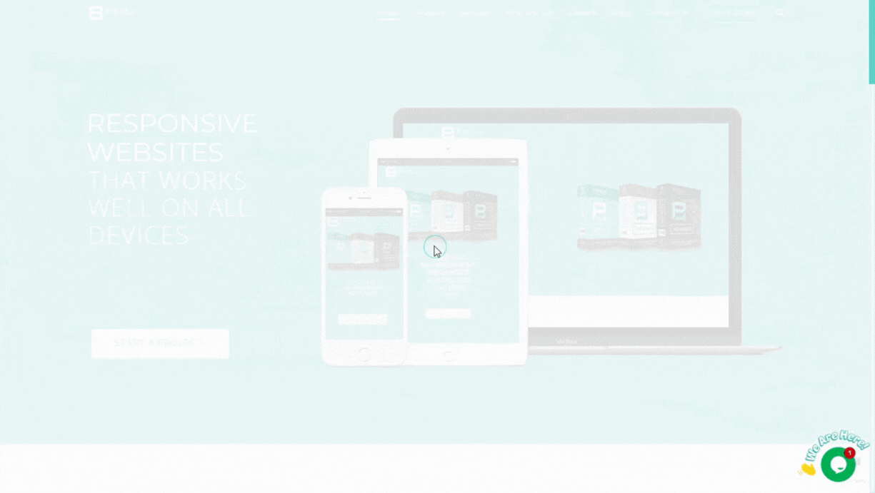
3. Responsive Design
Scenario: A customer checks the website from their smartphone, but the images are distorted, and the buttons don't work. The text is too small to read, and they can’t even find the menu. The poor mobile experience pushes them to try a competitor. Key Principle: In today’s mobile-first world, your website needs to work seamlessly on all devices—desktops, tablets, and smartphones. A responsive design adapts to different screen sizes, ensuring a smooth experience for every visitor.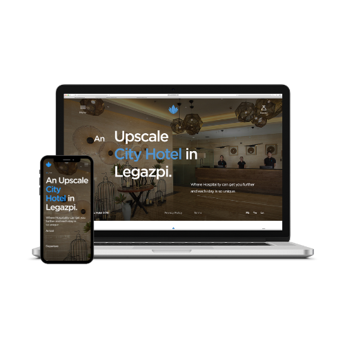
4. Brand Consistency
Scenario: The website’s color scheme is mismatched with the business's overall brand. The fonts and tone of messaging feel disconnected from the company's identity, causing confusion about the brand's image and values.. Key Principle: Your website is an extension of your brand. Ensure it reflects your company’s identity through consistent use of colors, fonts, and messaging. This strengthens brand recognition and builds trust with your audience.
5. Fast Load Time
Scenario: A visitor clicks on the business's website link, but it takes too long to load. Impatient, they decide to leave and look for another company with a faster, more responsive site. Key Principle: Slow websites lead to high bounce rates. Ideally, your website should load within 2 to 3 seconds to keep visitors engaged. If your site takes longer, users may get frustrated and leave, significantly increasing your bounce rate and losing potential customers. Optimize images, reduce unnecessary scripts, and choose a reliable hosting provider to ensure your site loads quickly and provides a smooth, user-friendly experience.
By following these design principles, your business website will not only look professional but also function effectively, helping you convert visitors into customers.
At Pixel8 Web Solutions & Consultancy, we help you bring these principles to life. From crafting clean, professional designs to ensuring responsiveness and fast load times, we work with you to build a website that not only looks great but performs exceptionally, driving your business forward. Top 10 Features Every Business Website Should Have
September 9, 2024 /
1 Comments
/
in Uncategorized
/
webmaster
7 Essential Elements for Planning a Successful Business Website
September 2, 2024 /
1 Comments
/
in Uncategorized
/
webmaster
7 Essential Elements for Planning a Successful Business Website
 photo: pexels
Having a website isn’t enough — you need a strategic plan that aligns with your business goals and drives growth. Strategic website planning ensures that every aspect of your site is designed to attract, engage, and convert visitors. Here’s how to develop a strategic website plan that can help your business succeed.
photo: pexels
Having a website isn’t enough — you need a strategic plan that aligns with your business goals and drives growth. Strategic website planning ensures that every aspect of your site is designed to attract, engage, and convert visitors. Here’s how to develop a strategic website plan that can help your business succeed.
1. Understand Your Business Goals
The first step in strategic website planning is to have a clear understanding of your business goals. Whether you’re looking to boost sales, generate leads, or increase brand awareness, your website should be designed to meet these objectives. For example, if generating leads is your goal, your website should focus on capturing visitor information through forms, CTAs, and offers.
2. Identify Your Target Audience
To create a website that resonates with your visitors, you need to know who your target audience is. Conduct research to understand their needs, preferences, and online behaviors. This information will guide the design, content, and functionality of your website to ensure it meets your audience’s expectations and encourages them to take action.3. Prioritize User Experience (UX)
A critical component of strategic website planning is prioritizing user experience (UX). A website that is easy to navigate, visually appealing, and responsive will keep visitors engaged and encourage them to take action. However, ensuring top-notch UX requires specialized knowledge. This is where professional companies like Pixel8 can make a difference. Experts can design a website that not only looks good but also functions seamlessly, helping to convert visitors into customers. photo: unsplash
4. Develop a Content Strategy
A strategic content plan should include high-quality blog posts, videos, and other materials that align with your business goals and resonate with your audience. Incorporating SEO best practices will help your content rank higher in search engine results, bringing more traffic to your site. Once your content strategy is in place, it’s essential to keep your website content fresh and relevant. While you focus on creating the content, companies like Pixel8 can assist by regularly updating it on your website. This ensures that your site remains current and continues to effectively engage your audience without you needing to manage the updates yourself.5. Optimize for Search Engines (SEO)
SEO is essential for ensuring your website is visible to potential customers. Make sure your website is optimized with relevant keywords, meta tags, and mobile-friendly design. Regularly updating your SEO strategy will keep your website competitive in search engine rankings. photo: unsplash
6. Plan for Scalability
As your business grows, your website needs to grow with it. A strategic website plan should include provisions for scalability, allowing you to add new features and content as needed. Pixel8 can assist by ensuring your website is built on a flexible, scalable platform that can adapt to your evolving business needs.7. Monitor Performance and Make Data-Driven Decisions
Finally, regularly monitoring your website’s performance is crucial for ongoing success. Use analytics tools to track key metrics such as traffic, bounce rates, and conversions. Based on this data, make informed decisions to adjust your strategy. If you need help interpreting the data or making necessary adjustments, Pixel8 can provide expert insights and support, ensuring your website continues to align with your business goals and drive growth. photo: unsplash
 8 Important Reasons Why You Need a Website
August 24, 2024 /
1 Comments
/
in Uncategorized
/
webmaster